In this one, I want to talk about the output of data. How we frame the output of an algorithm is as delicate as the original choice of algorithm itself. The informal cycle I have been working with has been data sourcing and preparation, followed by processing (applying statistical methods and machine learning algorithms), and then presenting that in a form that people can understand.
In each of these procedural points, decisions have to be made.
Take a gander at the following two charts:
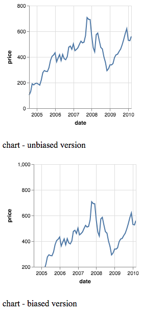
They look different. But they also look the same. What accounts for this? In the second chart, a great deal of empty space up top evokes some kind of downward, negative pressure. Assuming that the viewer is a native user of a language that reads left-to-right, top-to-bottom, one might be inclined to say that the first graph shows good performance, and the second indicates worse performance.
On closer examination, however, there is no actual difference in the graph. The differences are in the y-axis. In the second chart, the y-axis begins at 200 (rather than 0), and goes all the way up to 1000. The peak, just before 2008, remains just over 700 in both graphs. Both charts use and represent the same data without any distortion. So the manipulation is at the framing-level.
Future installments will cover some sneakier ways to present data. The source code for this example can be found here on my github.